

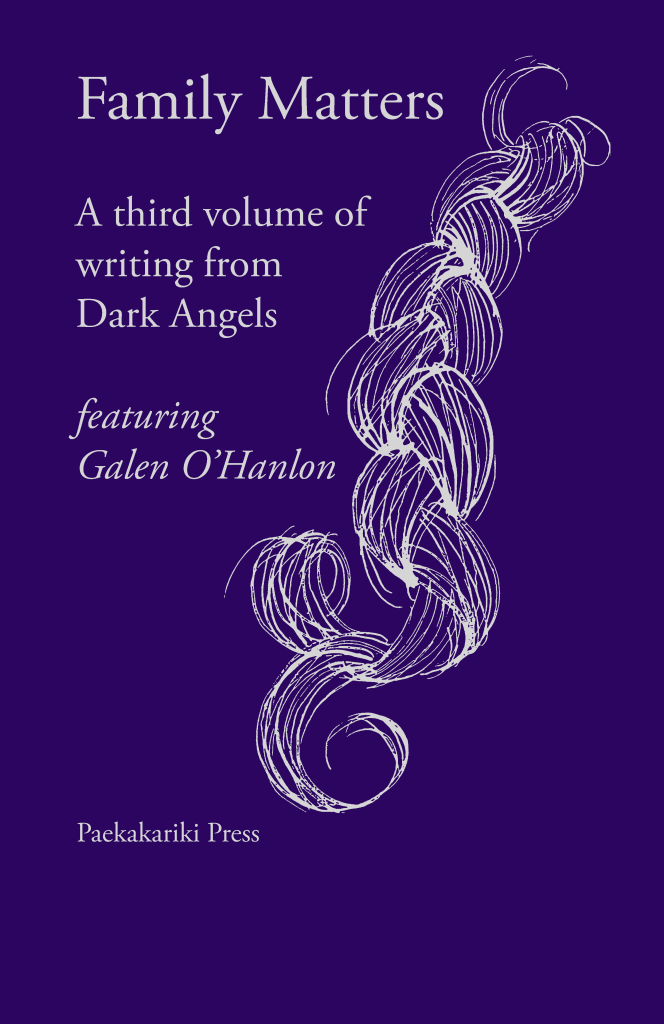
A new anthology of Dark Angels poetry is now an eagerly anticipated event. The latest, Family Matters, is the third in the series, all produced in partnership with Paekakariki Press, using traditional typesetting and printing methods.
It’s a handsome volume, containing the work of 18 Dark Angels poets, many of them also members of 26. The anthology is edited by John Simmons, Thérèse Kieran and Tim Rich. (John and Tim are two of 26’s co-founders.) The main featured poet is Galen O’Hanlon, a previous winner of the 26 project writing award. In all there are 18 poets, including Susannah Hart (winner of the National Poetry Competition) and Rowena Roberts who sadly died before she could see her two poems printed in the book.
Work of such quality deserved visual interpretation to match. Lydia Thornley, known to 26 for her live sketches at recent Wordstocks, was invited. The following conversation between John Simmons and Lydia Thornley tells you more about the book and the visual process.
JS: I’ve always enjoyed working with visual artists – it’s deep in my experience and that of other 26 members. We value and respect the visual in partnership with the verbal. The cover illustrations for Dark Angels poetry books (the first by David Carroll, the second by Lisa Andrews) are always an important and exciting part of the production process. So I was delighted when you agreed to create artwork for the cover of Family Matters, Lydia.
What impressed me especially was that, having agreed to do it, you wanted to read the poems as the first step. Not all book designers are so diligent, but I feel it really paid off. Not only is the cover illustration beautiful but it brings another perspective, a perfectly fitting one, to the theme of the book. The poems are about the emotion and diversity of family relationships, a difficult thing to capture visually, but you did it elegantly. Tell us more about your thinking and how you executed it.
LT: Delving into the subject matter is one of the great privileges of my work. Words are part of my ideas process so reading was a natural first step. Therein lay the discovery that each poem was wonderful and each unique – so I wanted to pick up themes without favouring one poem over another.
This was the first time I’d illustrated for letterpress so I visited Paekakariki Press to find out what would work best technically. To honour the craft process, I chose dip pen to draw with.
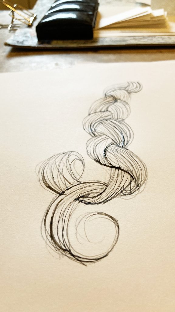
Only then did I start on draft illustrations: hair, intensely personal, families plaiting people together; a string of beads, handed-down, scattered, broken and remade; a wave-curl of sea and hair; my own hand (obvious – but because it was obvious, I thought I should); and in my only direct reference to one poem, because I had a similar story and it brought a lump to my throat, the moon.
What made you pick the plait?
JS: I shared your options with fellow editors/poets Thérèse and Tim. We loved your work and the way you presented it, but we all agreed that the ‘plait’ was the one we wanted. It expressed so much: the way hair contains family DNA as well as being known historically as a love token, cutting a tress of hair to put into a locket for a loved one. Also, because the printing would be in silver ink it reflected the aging element of family life too. After all, the poems range across generations: parent/child, siblings, grandchildren and grandparents.
The other thing we had to consider was the series look. This is the third in our Dark Angels series, so it needed to complement its forebears, to be seen as one of the family. It does this beautifully. But it must have been quite tricky to actually draw?
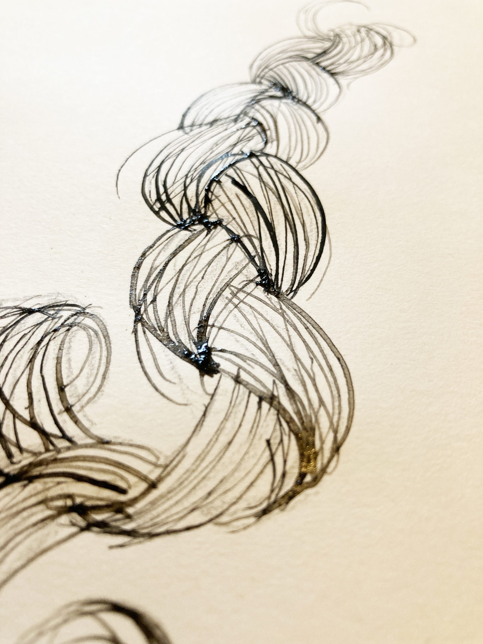
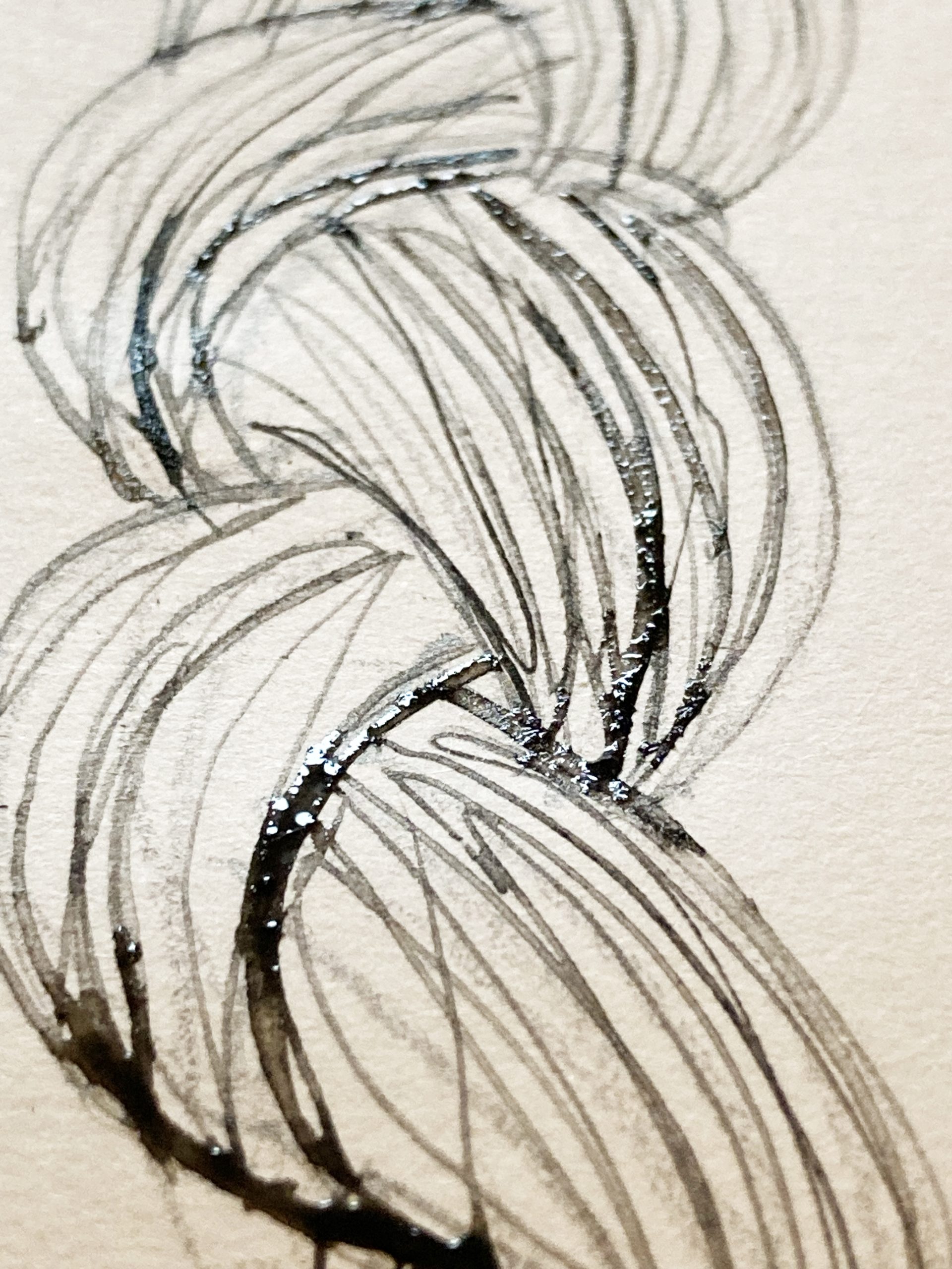
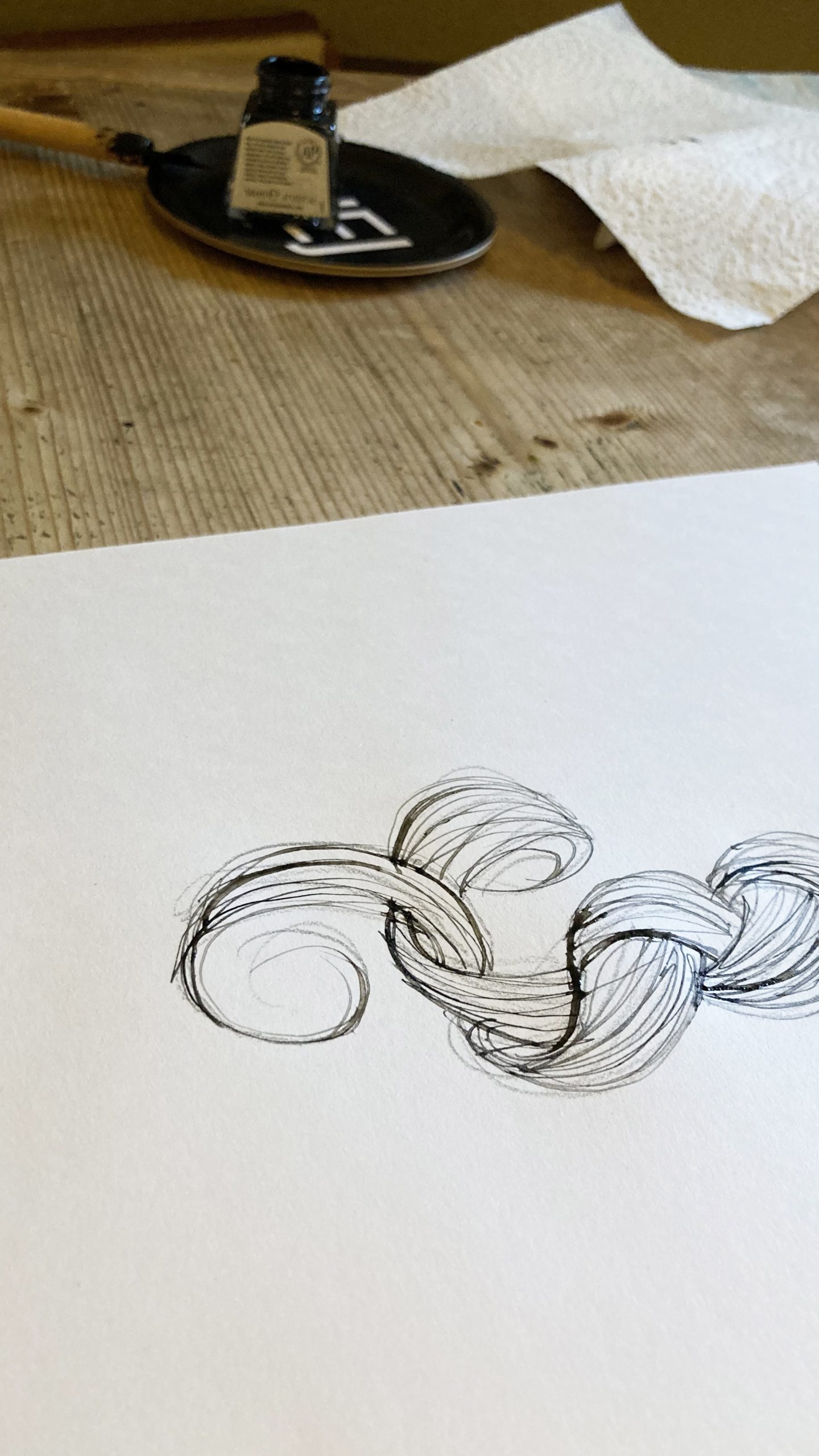
LT: It was a good idea when I thought it quickly: plait my own hair; take a picture to draw from. The reality was me in contortions of reference, sheet of white paper behind my unruly mop, unable to see what I was doing…
Time in my silver, there was time, too, in my choice of drawing tool: a Gillot 303 nib, with me since college.
A dip pen knows its own mind. We circled around each other scratchily until I’d re-learned its ways. For print, I drew in black. Expecting blackness from my ink, it gave me the translucency of watercolour… so for letterpress, I scanned and flattened it.
Now, I can almost hear the heft of the Heidelberg press…
JS: It’s interesting to hear about the tools of a related craft. I still write first drafts of writing in pencil by hand (Blackwing pencils, favourite of Stephen Sondheim). Writing in pencil on paper gets me closer to my thoughts and emotions than writing on a keyboard/screen. And the poems do have a depth of emotion – not just my four poems but everyone’s.
Our main featured poet is Galen O’Hanlon. He has the biggest section (10 poems) of the anthology, and I particularly love his poetry. He writes with deep feelings about his family who went before (father, mother, grandfather) and his own young children – with such lyrical intensity. Tim Rich was his editor and they had a wonderfully productive, creative relationship, going through all the poems line by line in great detail. And the outcome is…well, you just have to read them. And you did. Did you find the poems, from all the writers, spoke to you and your family relationships?
LT: I had poems to read from you, Galen O’Hanlon, Therese Kieran and Tim Rich.
Galen’s poem Look Mum, the MOON brings a tear every time I read it. My Mum would look at the moon in Wales and know that I would see the same moon in London. Now, I look at it for both of us.
The first verse of Tim’s poem Full of Infinity brings me the smell of wood shavings and tobacco fronds, my father trailing both as he came in from his workshop. I smile – I was always welcome there.
In Holding on, I love Therese’s kitten-wriggle of jiggly bones. I’ve known a dear friend’s four, grown now, since they were born, toddlers clambering over me like a human sofa.
And the river of liquid silver in your clever sonnet The Bridge of Time and Treasure became the silver of the illustration.
Copies of ‘Family Matters’ will be available from Paekakariki Press after 12th May https://paekakarikipress.com/?content=publications.php
You can also buy the book at its launch. Members of 26 welcome if you register https://www.tickettailor.com/events/darkangels/2155102
Lydia Thornley is a designer, creative director, illustrator and visual artist. See her work on her website https://thornley.co.ukand on Instagram https://www.instagram.com/lydiathornley/?hl=en